
How to Fix 5 Common Print-on-Demand Design Mistakes
Your print-on-demand business is losing sales because of avoidable design mistakes that make your products look unprofessional. These print on demand design mistakes can turn potential customers away and damage your brand reputation before you even get started.
This guide is for POD entrepreneurs, graphic designers, and online sellers who want to create products that actually sell instead of sitting in digital storefronts collecting virtual dust.
You'll learn how to fix the five most common POD design errors that kill conversions. We'll cover why poor resolution destroys your professional appeal and makes customers scroll past your listings. You'll also discover how to solve text readability print on demand problems that cost you sales when customers can't read your designs clearly. Finally, we'll tackle bleeding margins printing issues that turn your carefully crafted designs into cropped disasters.
Stop losing money on design problems you can easily prevent. Let's fix these issues so your products stand out for all the right reasons.
Poor Resolution That Kills Professional Appeal
Understanding DPI requirements for different print products
Print on demand design mistakes often start with resolution problems that make your products look cheap and unprofessional. Different POD platforms and product types need specific DPI (dots per inch) settings to ensure crisp, clear printing.
T-shirts and apparel typically require 300 DPI for detailed designs, while simpler graphics can work at 150-200 DPI. Posters and wall art need at least 300 DPI to avoid pixelation when printed at larger sizes. Phone cases and small accessories demand the highest resolution at 300-600 DPI since customers examine these products up close.
| Product Type | Minimum DPI | Recommended DPI | Maximum File Size |
|---|---|---|---|
| T-shirts | 150 | 300 | 25MB |
| Posters | 200 | 300-600 | 100MB |
| Phone Cases | 300 | 600 | 50MB |
| Mugs | 150 | 300 | 25MB |
| Canvas Prints | 150 | 300 | 150MB |
Identifying pixelated images before uploading
Catching print quality issues before your designs go live saves time, money, and customer complaints. Zoom into your design at 100% or higher in your design software - if you see jagged edges, blurred details, or visible pixels, your resolution needs work.
Look for these warning signs:
-
Fuzzy text that becomes unreadable when enlarged
-
Stair-step edges on curved lines or circles
-
Blurry photographs or graphics
-
Color banding in gradients
-
Loss of fine details in complex designs
Your design software's zoom feature is your best friend here. If the image looks crisp at 200-300% zoom, you're probably good to go.
Finding high-quality image sources and alternatives
Stock photo sites like Unsplash, Pexels, and Pixabay offer free high-resolution images, but always check licensing for commercial use. Premium platforms like Shutterstock and Adobe Stock provide guaranteed commercial rights and higher quality options.
Vector graphics solve many resolution problems since they scale infinitely without quality loss. Sites like Freepik, Vecteezy, and IconFinder offer vector alternatives to pixelated images. When working with logos or text-heavy designs, always choose vector formats (SVG, AI, EPS) over raster images (JPG, PNG).
Create your own graphics using vector programs like Illustrator or free alternatives like Inkscape. This gives you complete control over quality and licensing.
Upscaling techniques that actually work
AI-powered upscaling tools have revolutionized how designers handle low-resolution images. Topaz Gigapixel AI, Waifu2x, and Real-ESRGAN can increase image resolution by 400-600% while maintaining sharp details.
Manual upscaling steps:
-
Start with the highest quality original image available
-
Use AI upscaling tools for photographs and complex graphics
-
Recreate simple graphics as vectors when possible
-
Test print small samples before committing to large orders
-
Always save your upscaled images in lossless formats
Photoshop's "Preserve Details 2.0" resampling method works well for moderate upscaling (up to 200%), while dedicated AI tools handle extreme enlargements better. Remember that upscaling can't create detail that wasn't there originally - starting with quality source material makes all the difference.
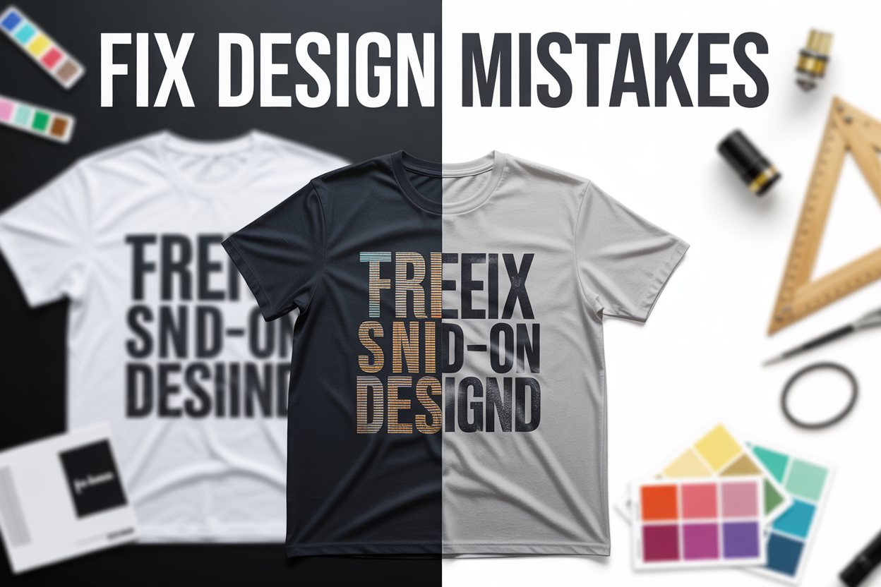
Text Readability Issues That Cost Sales

Choosing fonts that remain legible at small sizes
Font selection can make or break your print-on-demand designs, especially when customers view your products on mobile devices or when text appears at smaller sizes. Sans-serif fonts like Arial, Helvetica, and Open Sans typically perform better than decorative script fonts when scaled down. These clean, simple typefaces maintain their structure and readability even when printed on smaller items like mugs or phone cases.
Script and handwritten fonts might look stunning in your design software, but they often become illegible blobs when printed at actual product sizes. Stick to fonts with good letter spacing and avoid ultra-thin or ultra-bold weights that can either disappear or merge together during printing. Test your font choices by printing them at the actual size they'll appear on your products before finalizing your design.
Creating proper contrast between text and background
Poor contrast is one of the most common text readability print on demand mistakes that directly impacts sales. Your text needs sufficient contrast against its background to ensure customers can easily read product information, slogans, or messages. Dark text on light backgrounds or light text on dark backgrounds work best, but avoid combinations like yellow text on white or light gray text on slightly darker gray.
Use online contrast checkers to verify your color combinations meet accessibility standards. A good rule of thumb: if you squint at your design and can't clearly read the text, your customers won't be able to either. This becomes even more critical for POD design errors when printing on colored fabrics or materials where the base color affects the final appearance.
Avoiding overcrowded design layouts
Cramming too much text into your design creates visual chaos and reduces readability across all product sizes. White space isn't wasted space – it's essential for guiding the eye and making your message clear. Give your text room to breathe by maintaining adequate spacing between lines, words, and design elements.
Consider your product's viewing distance when planning text placement. T-shirt designs need larger, bolder text since people view them from several feet away, while notebook covers can accommodate smaller text since users hold them closer. Create hierarchy in your text by varying sizes and weights strategically, ensuring the most important information stands out while supporting details remain readable but secondary.
Bleeding and Margin Errors That Ruin Final Products
Setting up proper bleed areas for seamless printing
Bleeding margins printing issues happen when designers don't account for the cutting process during production. Think of bleed as your safety net - it's extra design area that extends beyond your final product size. Most print-on-demand platforms require a 3-6mm bleed area on all sides, but this varies by product and provider.
When you create designs without proper bleed, you risk getting thin white borders around your finished products. This happens because cutting machines aren't perfectly precise, and slight variations can expose the white paper or fabric beneath your design. Your customers will notice these unprofessional edges immediately.
Set up your canvas size to include bleed from the start. For a standard 8x10 inch print with 3mm bleed, create your canvas at 8.24x10.24 inches. Extend your background colors, patterns, and any design elements that touch the edges all the way to this expanded canvas boundary.
| Product Type | Typical Bleed Requirement |
|---|---|
| Posters/Prints | 3-6mm all sides |
| T-shirts | 0.125-0.25 inches |
| Business Cards | 2-3mm all sides |
| Mugs | Varies by print area |
Popular design software like Photoshop, Canva, and Figma all have bleed settings you can enable. Don't just resize your finished design to add bleed - this creates pixelated edges and color inconsistencies.
Keeping important elements within safe zones
Safe zones protect your most crucial design elements from getting cut off during production. This invisible boundary sits inside your design area, typically 3-6mm from all edges. Anything outside this zone risks being trimmed away or appearing too close to the edge.
Your text, logos, and key visual elements must stay within these safe margins. POD design errors often stem from designers placing important content too close to edges, assuming the cutting will be perfect. Real-world production involves human handling and machine tolerances that can shift your design slightly.
Create visible guides in your design software to mark these safe zones. Most platforms provide templates with pre-marked safe areas, but you can also calculate them yourself. For that 8x10 print example, your safe zone would be approximately 7.76x9.76 inches, leaving breathing room on all sides.
Consider the visual weight of your design elements too. Even if text technically fits within safe zones, cramped layouts look unprofessional. Give your important elements extra space to breathe - your customers will appreciate the clean, polished appearance.
Understanding trim lines and their impact on design
Trim lines mark where cutting machines will slice through your printed material. These lines don't appear on your final product but serve as crucial guides during the production process. Misunderstanding trim lines leads to some of the most frustrating print quality issues designers face.
Different products have different trim requirements. T-shirt designs don't get physically cut like posters, but they have print boundaries that function similarly. Stickers and labels have precise cutting paths that follow your design shape. Books and magazines require multiple trim lines for covers, spines, and interior pages.
When designing across product sizes, scaling issues become apparent at trim lines. A design that works perfectly on a small sticker might lose important details when scaled up for a poster, especially near the cutting edges. Test your designs at multiple sizes and pay attention to how elements near trim lines perform.
Your design software should display trim lines as non-printing guides. If you're working with print-on-demand platforms, download their specific templates rather than guessing measurements. Each platform has slightly different requirements, and small variations in trim expectations can ruin otherwise perfect designs.
Always preview your designs with trim lines visible before submitting. Zoom in on corners and edges to check for potential cutting problems. A few minutes of careful review prevents disappointing final products and unhappy customers.
Color Problems That Disappoint Customers
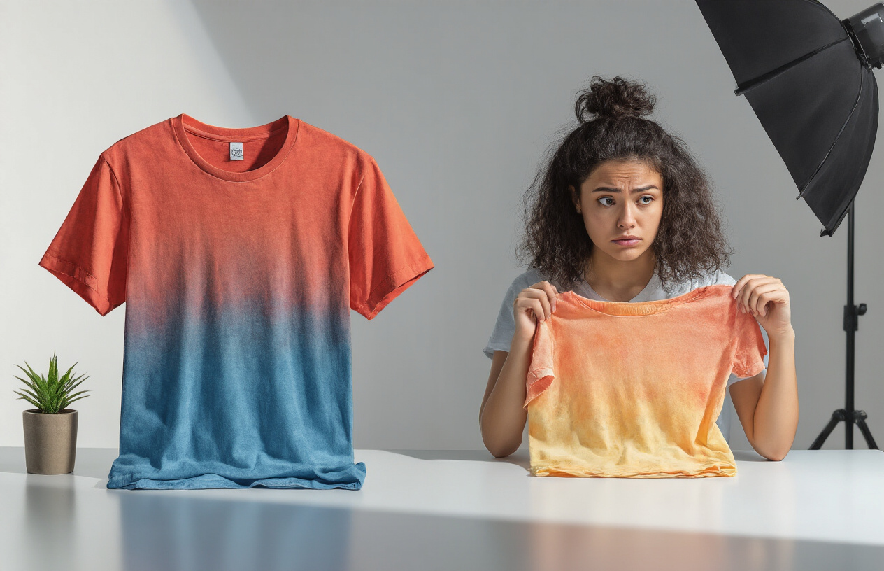
Converting RGB designs to CMYK for accurate printing
Most designers create their work on screens using RGB color mode, but print-on-demand products require CMYK colors. This fundamental mismatch causes major headaches when your vibrant screen design turns into a dull, muddy print. RGB displays colors using light, while CMYK uses ink, creating completely different color ranges.
Always convert your designs to CMYK before submitting them to POD platforms. Popular design software like Photoshop, Illustrator, and Canva offer CMYK preview modes. You'll immediately notice how some colors shift dramatically - bright neons often become significantly duller, and certain blues may appear purple.
Smart designers create their artwork directly in CMYK mode from the start. This approach prevents disappointment later and gives you a realistic view of how your final product will actually look. Pay special attention to bright greens, vibrant oranges, and electric blues - these colors typically suffer the most during conversion.
Avoiding colors that shift dramatically in print
Certain colors are notorious troublemakers in print on demand design mistakes. Neon colors, electric blues, hot pinks, and bright purples rarely translate well from screen to fabric or paper. These colors often shift to completely different hues, leaving customers confused and disappointed.
Build your color palette around print-safe colors. Earth tones, deep blues, classic reds, and neutral grays consistently print well across different POD platforms and products. When you must use problematic colors, create buffer versions that account for the shift.
Monitor-safe doesn't mean print-safe. That stunning cyan that pops on your screen might print as a flat, grayish blue. Test small batches of products with challenging colors before launching full campaigns to avoid costly surprises.
Testing color profiles before finalizing designs
Different POD platforms use different printers and color profiles, which means your design might look completely different across various services. Order sample products from your chosen platform before launching any major campaign.
Create test swatches with your core color palette printed on actual products. This real-world testing reveals how colors behave on different materials - cotton absorbs ink differently than polyester, and paper products show colors differently than fabric items.
Document successful color combinations for future reference. Build a personal database of colors that work well with specific POD providers and product types. This preparation saves time and reduces color accuracy printing problems down the road.
Managing customer expectations about color variations
Transparent communication prevents negative reviews and returns. Include clear disclaimers about potential color variations between screen displays and printed products. Most customers understand these limitations when explained properly.
Show multiple product photos under different lighting conditions. Natural light, indoor lighting, and flash photography all reveal different aspects of your colors. This comprehensive approach gives customers realistic expectations about their purchase.
Respond quickly to color-related complaints with solutions, not excuses. Offer reprints or refunds for significant color discrepancies, and use customer feedback to improve your color choices for future designs. Building trust through honest communication creates loyal customers who understand the print on demand process.
Design Scaling Failures Across Product Sizes
Creating Adaptable Designs for Multiple Product Formats
Design scaling issues plague countless print-on-demand sellers who create artwork without considering how their designs will translate across different products. A stunning design on a t-shirt can become completely illegible on a phone case or look cramped on a canvas print. Smart designers build flexibility into their artwork from day one.
Start by choosing design elements that work well at various sizes. Bold, simple graphics typically scale better than intricate details. Text-heavy designs often fail when shrunk down to small accessories, while minimalist designs maintain their impact across all product types. Consider creating multiple versions of your design – perhaps a detailed version for large prints and a simplified version for smaller items.
Vector graphics offer the best foundation for scalable designs since they maintain crisp edges at any size. When working with raster images, create your original artwork at the largest size you'll need, then scale down for smaller applications. This approach prevents pixelation and maintains quality.
Testing Artwork on Various Mockup Sizes
Never launch a design without testing it across different product mockups. What looks perfect on your computer screen might reveal serious flaws when applied to actual product dimensions. Create mockups for t-shirts, mugs, phone cases, posters, and other products you plan to offer.
Pay special attention to how your design appears on curved surfaces like mugs or water bottles. Text can become distorted, and graphics may lose their intended impact. Some print-on-demand platforms provide mockup generators that show your design on various products automatically.
Test your design at actual print sizes whenever possible. Print a small version on your home printer to see how details hold up. Many design scaling failures only become apparent when viewing the physical product rather than a digital preview.
Adjusting Element Proportions for Optimal Visibility
Different products require different approaches to element sizing and spacing. Text that's perfectly readable on an 18x24 poster becomes impossible to read on a 4-inch sticker. Successful POD designers adjust their proportions based on the final product size.
For smaller products, increase text size and simplify your design. Remove unnecessary details that won't be visible at the final size. On larger products, you can include more intricate elements and smaller text, but make sure the overall composition remains balanced.
Consider the viewing distance for each product type. Wall art is typically viewed from several feet away, so text can be smaller relative to the overall design. Apparel and accessories are viewed up close, requiring different proportion considerations.
Maintaining Design Integrity from Small to Large Items
Your brand recognition depends on maintaining consistent visual impact across all product sizes. The challenge lies in preserving your design's core message and aesthetic appeal whether it appears on a tiny enamel pin or a large canvas print.
Identify the essential elements of your design that must remain prominent at any size. These might include your main graphic, logo, or key text. Create a hierarchy that ensures these critical elements stay visible and impactful regardless of scaling.
Develop design guidelines that specify minimum sizes for text, logos, and important graphics. This prevents situations where scaling down makes crucial elements disappear or become unreadable. Many successful POD sellers create style guides that outline these specifications for consistent application.
Planning for Both Horizontal and Vertical Orientations
Product dimensions vary dramatically across POD platforms. T-shirts are typically wider than they are tall, while phone cases are usually taller than wide. Designing for only one orientation limits your product options and potential sales.
Create designs that work well in square formats, as this gives you the most flexibility. Square designs can be easily adapted for both horizontal and vertical products without major modifications. When this isn't possible, consider creating separate horizontal and vertical versions of popular designs.
Think about how text and graphics will flow in different orientations. A horizontal layout might work perfectly for a laptop sleeve but create awkward spacing on a vertical phone case. Plan your text placement and graphic positioning to accommodate both orientations from the design phase.
Smart spacing around your design elements prevents them from getting cut off when applied to different product shapes. Leave adequate margins on all sides, and avoid placing critical elements too close to edges where they might be trimmed during production.
Your print-on-demand business success depends heavily on getting these design fundamentals right. Poor resolution makes your products look cheap, unreadable text drives customers away, bleeding errors create unprofessional results, color issues lead to disappointed buyers, and scaling problems mean your designs look terrible on different product sizes. Each of these mistakes can seriously hurt your sales and brand reputation.
The good news is that fixing these issues doesn't require expensive software or years of design experience. Start by checking your resolution settings, test your text at actual print sizes, leave proper margins for bleeding, understand your printer's color profiles, and create scalable designs that work across multiple products. Take time to order samples of your own products before launching them publicly. Your customers will notice the difference, and your sales will reflect the improved quality.


